Best House Painting Colours for Indian Homes in 2026: Room-by-Room Guide

The good news? Colour trends in 2026 are moving toward warmth, depth, and personality. For Indian homes, shades such as warm terracotta, sage green, dusty rose, warm beige, deep navy, and earthy clay work particularly well because they complement natural Indian light, wood finishes, and traditional as well as contemporary interiors.
What Are the Trending House Paint Colours in 2026?

Before we go room by room, it helps to understand the forces shaping colour choices this year. Three distinct influences are converging to define 2026's palette for Indian homes.
The warmth revival: Cool greys and stark whites dominated interiors for much of the last decade. In 2026, warm tones are firmly back in every corner of the design world. Warm whites, sandy beiges, terracottas, warm taupes, and creamy off-whites are replacing their cooler counterparts across both living spaces and kitchens.
Biophilic colour: As more people spend time working and living at home, there is a growing desire to bring the natural world indoors. Botanical greens, earthy ochres, clay tones, and the deep blue-greens of forest canopies are all having a significant moment in 2026, particularly in bedrooms and study spaces.
Bold and unapologetic accents: The era of playing it safe is over. Feature walls in deep, saturated colours, jewel tones, and dramatic darks are appearing in living rooms and dining areas as homeowners reclaim the joy of genuine colour. India, with its long tradition of colour in textiles, architecture, and daily life, is particularly well-suited to this direction.
Living Room: Where First Impressions Are Made
The living room sets the emotional tone of your entire home. It is where guests form their first impression and where your family spends the most time together. The colours here need to be welcoming, energising, and coherent with the natural light your room receives.
1. Warm Terracotta

Terracotta is one of the standout colour directions for 2026. It is earthy, warm, and deeply suited to Indian interiors, especially when paired with natural materials and warm lighting. In a north-facing living room, terracotta can add warmth to cool, diffused light, while in south- or west-facing rooms, it works particularly well as a feature wall.
Pair terracotta walls with off-white ceilings, natural cane or rattan furniture, jute rugs, and warm brass accents. The combination creates a living room that feels contemporary while still connecting with traditional Indian colours and materials.
Best for: North-facing living rooms or feature walls in larger, well-lit spaces.
Best shade: Asian Paints Colour 7466 (Copper Clay) or Berger Silk Breathe Easy in Sandstone.
2. Warm Sage Green

Sage green brings a softer interpretation of the nature-inspired colour trend. It sits comfortably between bold and neutral, making it easy to use across different living room styles. Use it on all four walls if you want a calm, enveloping feel, or use it behind the sofa or TV unit to create a subtle focal point.
Sage green works beautifully with warm wood furniture, cream or beige upholstery, terracotta accessories, indoor plants, and muted gold accents.
Best for: Contemporary, natural, and minimal living rooms.
Best shade: Asian Paints 8424 (Haze Green) or Nerolac Excel Total in Garden Mist.
3. Deep Navy or Indigo Accent Wall

If your living room receives plenty of natural light, deep navy or indigo can add depth without making the entire space feel dark. Rather than using it on every wall, consider it for the wall behind the sofa or TV unit to create a strong focal point.
Indigo also works naturally with Indian interiors, appearing across block-printed textiles, traditional fabrics, pottery, and handicrafts. Pair it with warm white walls, natural wood furniture, and small touches of rust or ochre through cushions, artwork, or décor.
Best for: Large or well-lit living rooms where you want a dramatic feature wall.
Bedroom: Where Colour Meets Rest
The bedroom calls for colours that feel comfortable and easy to live with every day. In 2026, bedroom palettes are moving beyond stark whites toward warmer neutrals, muted greens, soft blush tones, and deeper feature colours that create a more relaxed atmosphere.
1. Dusty Rose or Blush

Dusty rose and warm blush offer a more sophisticated alternative to bright pink. Their muted undertones bring warmth and softness to the room without making the colour feel overly sweet or childish.
These shades look especially beautiful in bedrooms that receive morning light. Pair them with warm white walls or ceilings, natural linen bedding, light wood furniture, and subtle copper or rose-gold accents for a soft, layered look.
Best for: East-facing bedrooms and bedrooms with plenty of morning light.
Best shade: Asian Paints 1163 (Tender Blush) or Dulux Weathershield in Peach Whip.
2. Clay and Warm Beige

Warm clay and honey beige are ideal if you want a neutral bedroom without the cold appearance sometimes associated with grey- or blue-based whites. These shades create a comfortable backdrop for wooden furniture, textured fabrics, ceramics, and layered bedding.
They can also work well in bedrooms with limited natural light because their warm undertones prevent the walls from appearing too flat or grey.
Best for: Bedrooms with limited natural light or interiors with warm wood furniture.
Best shade: Asian Paints 8108 (Caramel Latte) or Berger Breathe Easy in Adobe.
3. Forest Green or Moody Teal Feature Wall

For a master bedroom, a deep forest green, hunter green, or moody teal can create a dramatic but restful focal point. Using the colour behind the bed gives the room a sense of depth while keeping the remaining walls lighter.
The combination works particularly well with generous natural light, white or off-white bedding, natural wood furniture, and warm brass lighting. If the room is small or naturally dark, keep the darker shade limited to one wall.
Best for: Spacious master bedrooms with good natural light and a statement headboard or bed wall.
Kitchen: Fresh, Clean, and Full of Character
The kitchen is where practicality and personality need to coexist. Paint choices here have to account for moisture, grease, and the intensity of natural light that most Indian kitchens receive.
In 2026, kitchen colour is moving toward personality rather than the safe, builder-white walls that characterise many Indian apartments.
1. Warm White with Yellow Undertones
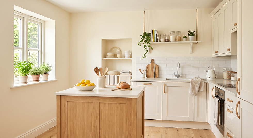
Not all whites look the same once they are on the wall. A warm white with subtle yellow or peach undertones can keep a bright kitchen looking crisp while avoiding the cold appearance of a blue-toned white.
It works particularly well with white, cream, beige, or light wood cabinets and can make smaller kitchens feel brighter and more open.
Best for: Bright kitchens and smaller spaces where you want to maximise the feeling of light.
Best shade: Asian Paints 8350 (Ivory Dust) or Dulux Weathershield Natural White.
2. Pale Sage or Mint Green

Pale sage and mint green are easy ways to bring the nature-inspired colour trend into a kitchen without overwhelming the space. They work especially well with white or light-coloured cabinets and can be used on a window-facing wall, backsplash wall, or a small feature section.
Pair the colour with white, light wood, natural stone, or brushed-metal finishes for a clean and fresh look.
Best for: Kitchens with white or light-coloured cabinetry and plenty of natural light.
3. Sunny Yellow Accent

A warm yellow can bring energy into a kitchen that feels dark or lacks natural light. Instead of covering the entire kitchen, use it as an accent on one wall or a smaller section where it can add warmth without becoming overpowering.
It pairs well with white cabinetry, natural wood, warm metals, and neutral countertops. In a north-facing kitchen, the warmer tone can also help balance the cooler quality of the available daylight.
Best for: North-facing or low-light kitchens that need a cheerful accent.
Children's Room: Joyful Without the Chaos
Children's rooms do not have to rely on bright primary colours to feel playful. In 2026, softer nature-inspired shades are becoming more popular because they can work across different ages and allow the room to evolve as the child grows.
1. Soft Mustard or Warm Yellow

Mustard yellow brings warmth and energy without the intensity of primary yellow. It can work in a nursery just as easily as in an older child's room, making it a practical colour that does not need to be replaced every few years.
Use it on one wall or combine it with warm white, natural wood, or muted green. Colourful bedding and artwork can then provide the brighter accents.
Best for: Children's rooms that need warmth, personality, and an adaptable colour scheme.
2. Sky Blue or Powder Blue

Soft sky blue and powder blue create an open, airy feeling and work well in smaller children's rooms. Rather than using a highly saturated blue, choose a softer shade that can grow with the child.
Pair it with white, cream, natural wood, or small accents of coral and yellow through bedding, artwork, and accessories.
Best for: Small rooms or spaces where you want a light, open appearance.
3. Soft Peach

Soft peach combines the warmth of pink with the energy of orange while remaining gentle enough for everyday living. It can add warmth to a child's room without making the space feel overly themed.
Use it with warm white furniture, light wood, cream textiles, and muted green or yellow accessories for a balanced palette.
Best for: Warm, cheerful children's rooms that need a softer alternative to pink or orange.
Pooja Room: Sacred, Serene, and Intentional
The pooja room deserves its own colour consideration. As a space associated with prayer and reflection in many Indian homes, its colour palette is often chosen to create a warm, peaceful, and intentional atmosphere.
1. Saffron or Deep Turmeric Yellow

Saffron and turmeric yellow have strong cultural and traditional associations in India and can give a pooja room a warm, devotional character. They work particularly well when combined with white marble, cream surfaces, traditional woodwork, and brass or gold-toned accents.
If the room is small, consider using the stronger shade on a single wall rather than covering the entire space.
Best for: Traditional or Indian-inspired pooja rooms where you want a warm and vibrant backdrop.
2. Ivory or Warm Cream

For a quieter and more understated pooja room, ivory and warm cream create a soft background that works well with both contemporary and traditional interiors. These shades also reflect the glow from diyas and warm lighting beautifully.
Pair them with wooden detailing, brass elements, white marble, flowers, and subtle gold accents to keep the space serene without making it feel plain.
Best for: Small pooja rooms, minimalist interiors, or homes that already have strong decorative elements.
Best Paint Colours for Each Room
Room | Recommended Colours | Best For |
Living Room | Terracotta, Sage Green, Navy | Warmth, personality, focal points |
Bedroom | Dusty Rose, Warm Beige, Forest Green | Calm and relaxation |
Kitchen | Warm White, Sage, Mint, Yellow | Freshness and brightness |
Children's Room | Mustard, Sky Blue, Soft Peach | Cheerful, adaptable spaces |
Pooja Room | Saffron, Turmeric, Ivory | Warm and serene atmosphere |
How to Choose Paint Colours for Your Indian Home
1. Should you test the colour first?
Paint a 30 × 30 cm patch on the actual wall and check it in morning, afternoon, and evening light before painting the entire room.
2. How does wall direction affect paint colour?
North-facing: warmer shades generally work well with cooler, diffused light.
South-facing: can handle softer or cooler shades because of stronger natural light.
East-facing: warm colours can look especially attractive in morning light.
West-facing: deeper or cooler tones can balance the warmer afternoon light.
3. Which paint finish should you use?
Living room → Matte/Eggshell
Bedroom → Matte/Eggshell
Kitchen → Satin/Semi-gloss
Children's room → Washable Satin/Semi-gloss
Pooja room → Matte
4. What about the ceiling?
A lighter version of the wall colour can create a more cohesive look, while a darker ceiling can work as a deliberate statement in spaces such as dining rooms.
Which Paint Finish Is Best for Each Room?
Room | Recommended Finish | Why |
Living Room | Matte / Eggshell | Creates a soft, sophisticated look and hides minor wall imperfections |
Bedroom | Matte / Eggshell | Gives the room a calm, non-reflective finish |
Kitchen | Satin / Semi-gloss | Easier to clean and better suited to moisture and stains |
Children's Room | Washable Satin / Semi-gloss | More practical for marks and frequent cleaning |
Pooja Room | Matte | Creates a soft, warm appearance |
Bring Your Colour Ideas to Life with Ideas & Living
Choosing the right paint colour is only the first step. The way it looks with your flooring, furniture, lighting, wardrobes, and overall room layout can completely change the final result.
At Ideas & Living, our interior design experts help you bring these ideas together with personalised designs, 3D visualisations, and material selections tailored to your space and budget.
Ready to see what your home could look like?
Book a Free Online Design Consultation with Ideas & Living today.
Frequently Asked Questions (FAQs)
Q1. Which paint colour makes a small room look bigger in an Indian apartment?
Light, warm neutrals are among the best choices for making a small room feel larger. Warm whites, light sandy beiges, and pale sage greens reflect light well without the cold feeling of stark blue-whites. Using a similar colour across the walls and ceiling can also create a more seamless, spacious look. If you prefer darker shades, consider using them on just one accent wall.
Q2. What are the best paint colours for Indian homes in 2026?
Popular paint colour choices for Indian homes in 2026 include terracotta, warm clay, sage green, dusty rose, warm beige, forest green, and deep navy or indigo for accent walls. Warm neutrals such as honey beige, caramel, and ivory are also popular for creating softer, more inviting interiors.
Q3. Which paint finish should I use for different rooms in my home?
Matte or eggshell finishes generally work well in living rooms and bedrooms, while satin or semi-gloss finishes are more practical for kitchens, bathrooms, and children's rooms because they are easier to clean. High-gloss finishes are better suited to trim, doors, and woodwork than large wall surfaces. Refer to the paint-finish guide above for a room-by-room breakdown.
Q4. How do I choose paint colours if my home has limited natural light?
Rooms with limited natural light usually work well with warm whites, sandy beiges, soft mustard, and warm clay or terracotta tones. These shades can help the space feel warmer and less flat. Avoid very cool whites and blue-based greys if the room already feels dark. Mirrors and warm-toned artificial lighting can also help brighten the space.
Q5. What are the best bedroom colours for a calm and restful atmosphere?
Soft, muted shades such as dusty rose, warm blush, sage green, and warm beige are popular choices for creating a calm bedroom. Deeper colours such as forest green or navy can also work well as a feature wall behind the bed, particularly when paired with lighter walls, natural wood, and soft lighting. Very bright or highly saturated colours may feel more energetic, so quieter tones are often preferred in sleeping spaces.
Q6. Should I use different colours in different rooms or stick to one palette throughout the home?
A unified base palette of two or three colours can help different rooms feel connected, while room-specific accent colours add personality. For example, you could use warm white on ceilings and trim, a warm beige in corridors, terracotta in the living room, forest green in the master bedroom, and sage in the kitchen. Keeping some colours consistent across connecting spaces helps the overall home feel cohesive rather than disconnected.


Comments